This is from the same parking garage under downtown Helsinki where I spotted the banana-peel trashcan and the umbrella sign. It really is a treasure trove of interesting visual semiotics!
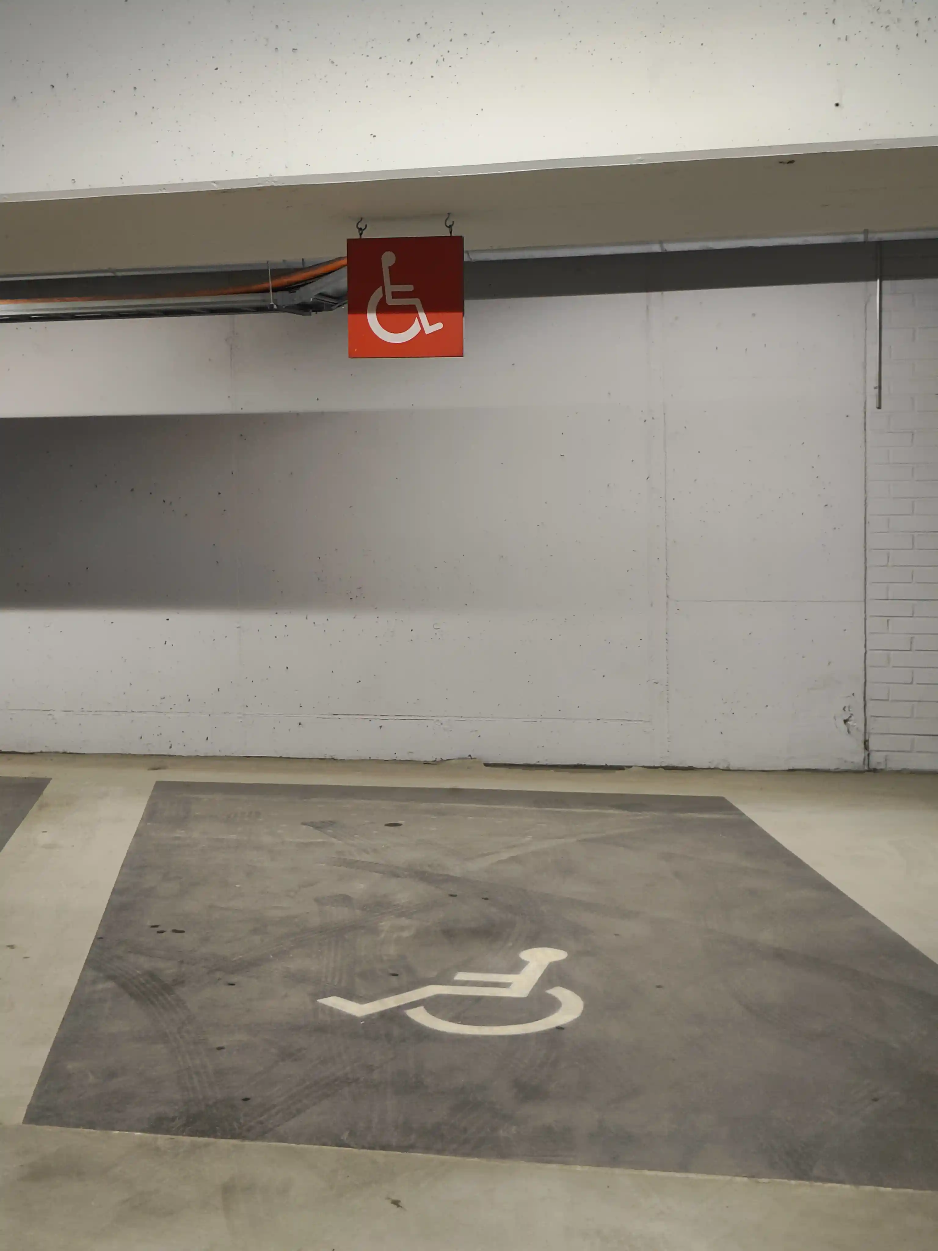
What we have here is a reserved parking space for the handicapped. It is signified in two ways, with the very large painted symbol on the floor and the red sign on top of it, both using the almost universal simplified icon of a person in a wheelchair.
But the color! For the various "handicapped parking/bathroom" signage that I've come across, at least in Finland, has pretty much universally been either white lines on blue background or thick white paint on asphalt. This one really pops out in color, and the location makes it highly visible for any driver. It would be interesting to know if this sign has always been there or if it was added due to people not observing the one painted on the ground?