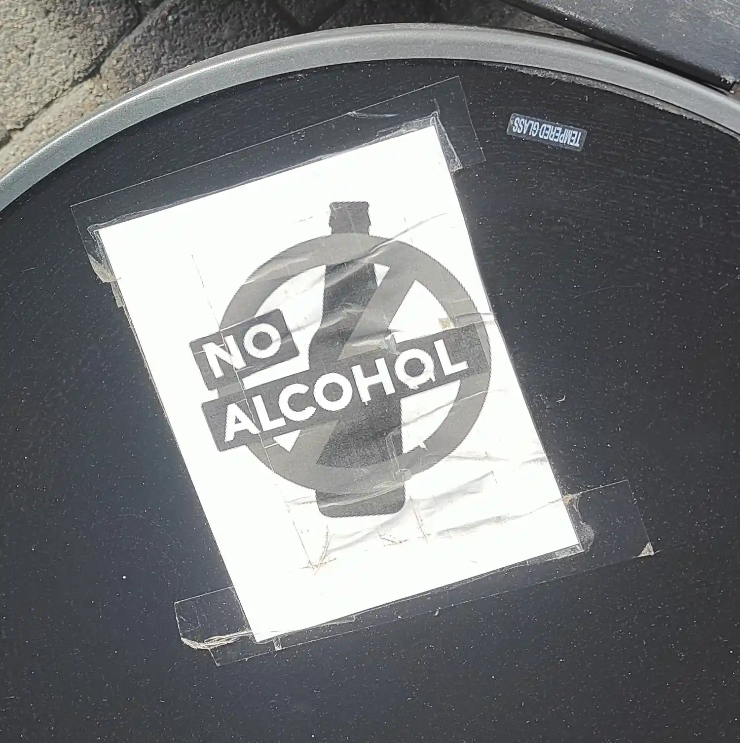
This sign, a black-and-white printout taped to the table, was seen outside the Jyväskylä Railway Station in Finland. It has a silhouette of a glass bottle, a slashed circle "NO" symbol and the text "NO ALCOHOL" all superimposed.
The meaning of the sign is quite clear, but what caught my attention was how rough it is. Not even a colour print, and instead of lamination it seemed to be covered with tape to survive the Finnish weather. This lack of effort or design felt like a message to the people for whom the sign was intended as well: "You don't deserve a fancy sign." Though, again, this might be reading too much to the sign vessel. Perhaps the shopkeep responsible was just busy or doesn't have the resources or time for a fancier sign when a simple one will do?