This post is part of our Boring series, where one Tuesdays we sometimes post analyses on signs we did not find particularly interesting. The idea is to offset personal biases.
It seems that more and more of the Boring series is based on images taken in my bathroom. This time I noted how my eyes just glanced over the label of a dental floss package.
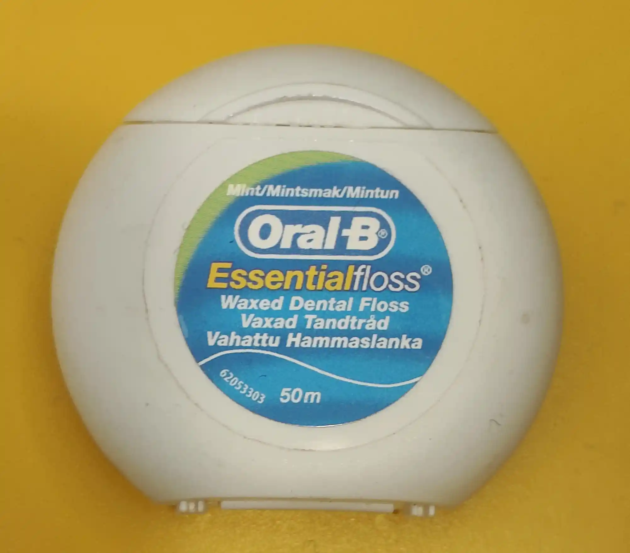
The sign here is mostly textual, with the green-blue coloring maybe hinting at freshness and the wavy white line functioning as an icon of the contents. I.e. floss. I think part of the Boring aspect for me is the lack of space for human interpretation. Semiotics is sometimes described as "[the study of] meaning-making", and when there is no space for interpretation, I feel like a boring algorithm.
...though from this point of view, is index the most boring aspect of signs as it "can't be helped"? I need to think on this.