This post is part of our Boring series, where one Tuesdays we sometimes post analyses on signs we did not find particularly interesting. The idea is to offset personal biases.

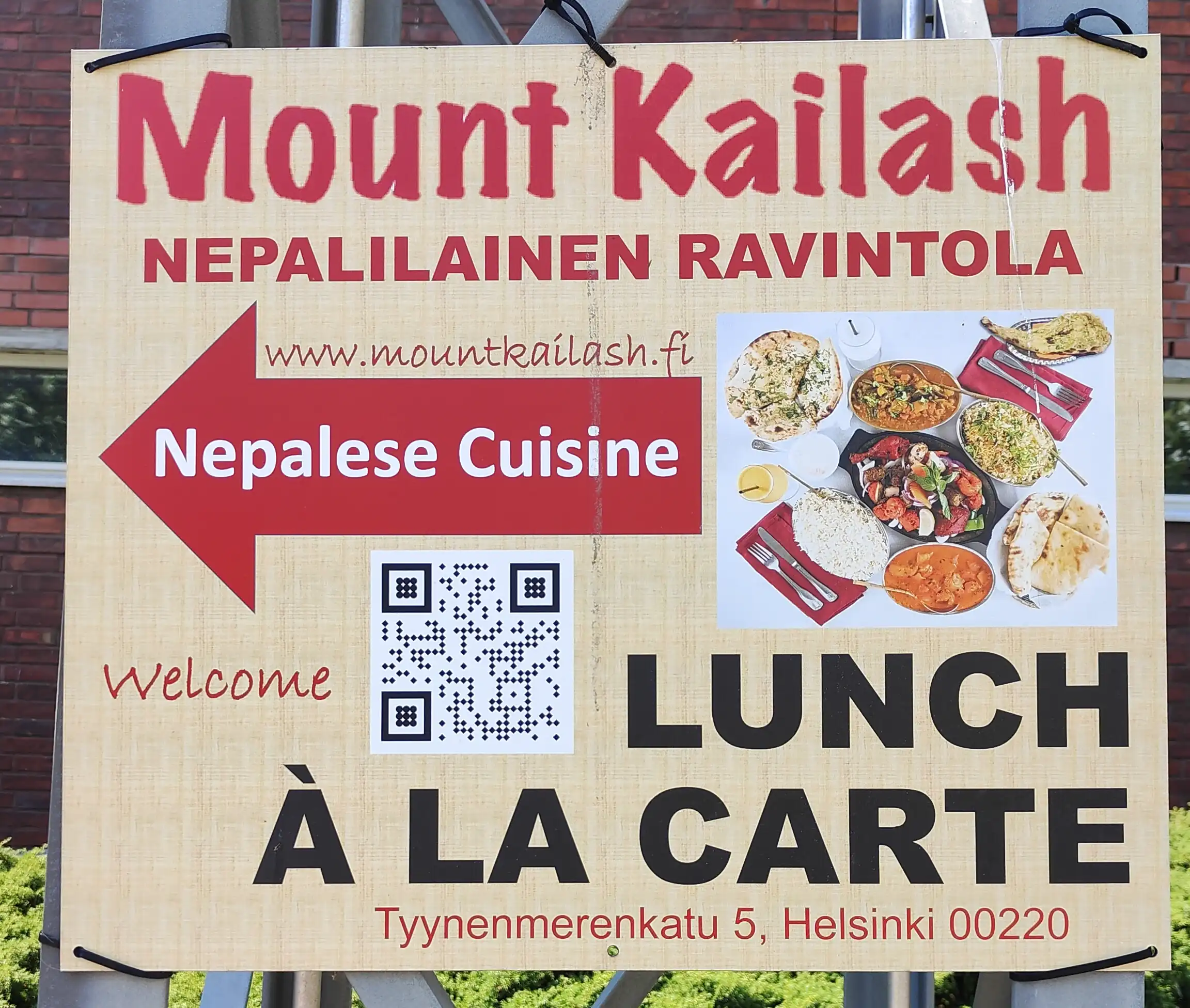
I feel like I should start this post by emphasizing that the topic is not bad signs, but rather signs that do not spark my semiotic interest. The sign we have here is a sign I saw on the street in Helsinki, Finland, directing the viewer towards a Nepalese restaurant. The sign is maybe a bit crowded with different fonts, colors, images&text and so forth, but it is not bad per se. I just don't find it very interesting.
We note that the sign vessel is somewhat sturdy, as it is held by zip ties that just go through holes in the sign. The sign gives the restaurant's name, address, web address, a QR-code presumably to the homepage and the arrow shows the direction relative to the current position. So after really looking at the sign there should be very little confusion on what the sign is about (a restaurant) and where it is (over there).