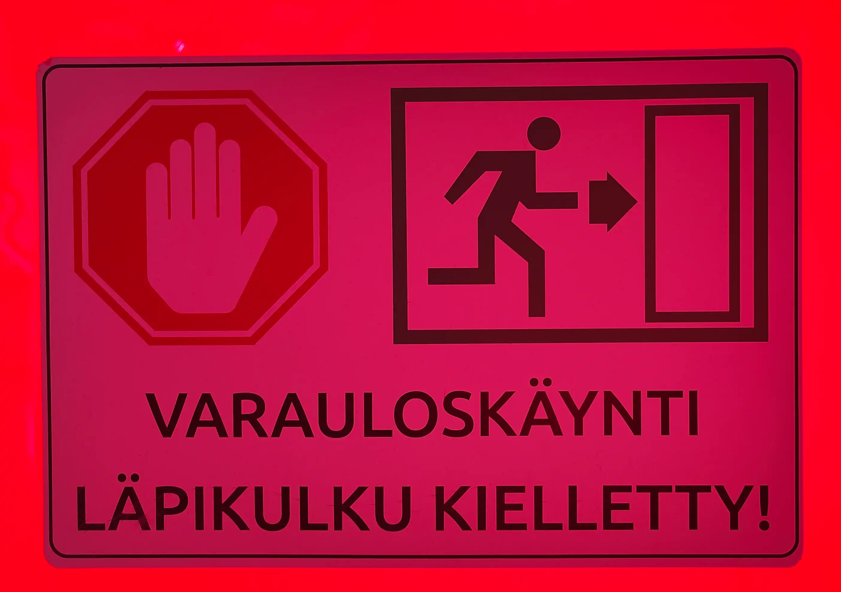
This sign I found at the lobby of a Finnish consumer electronics store in Ruoholahti, Helsinki. The ominous red background was due to the fact that this door was located on large glass doors which have some red-colored advertisement taping on them.
When translated, the text part says:
AN EMERGENCY EXIT
NO TRESPASSING!
The images displayed side-by-side are a standard "Don't go through here" hand with its palm facing the viewer, and the somewhat universal "emergency exit" sign. What I found interesting here is the sort of contradiction between the two images.
Without context, what do the images say? On the one hand we have "NO - GOING THROUGH HERE", so "don't use this door", but on the other hand we have "RUN THROUGH HERE", so "use this door". Maybe the effect would be that in a calm situation, people spend more time looking at the sign, considering the meaning and whether they should obey the hand, while in an emergency they'll just spot the emergency exit symbol and dash through?
In any case, I doubt this is causing any actual confusion in digesting the sign meaning, but I find the contrast interesting nonetheless.