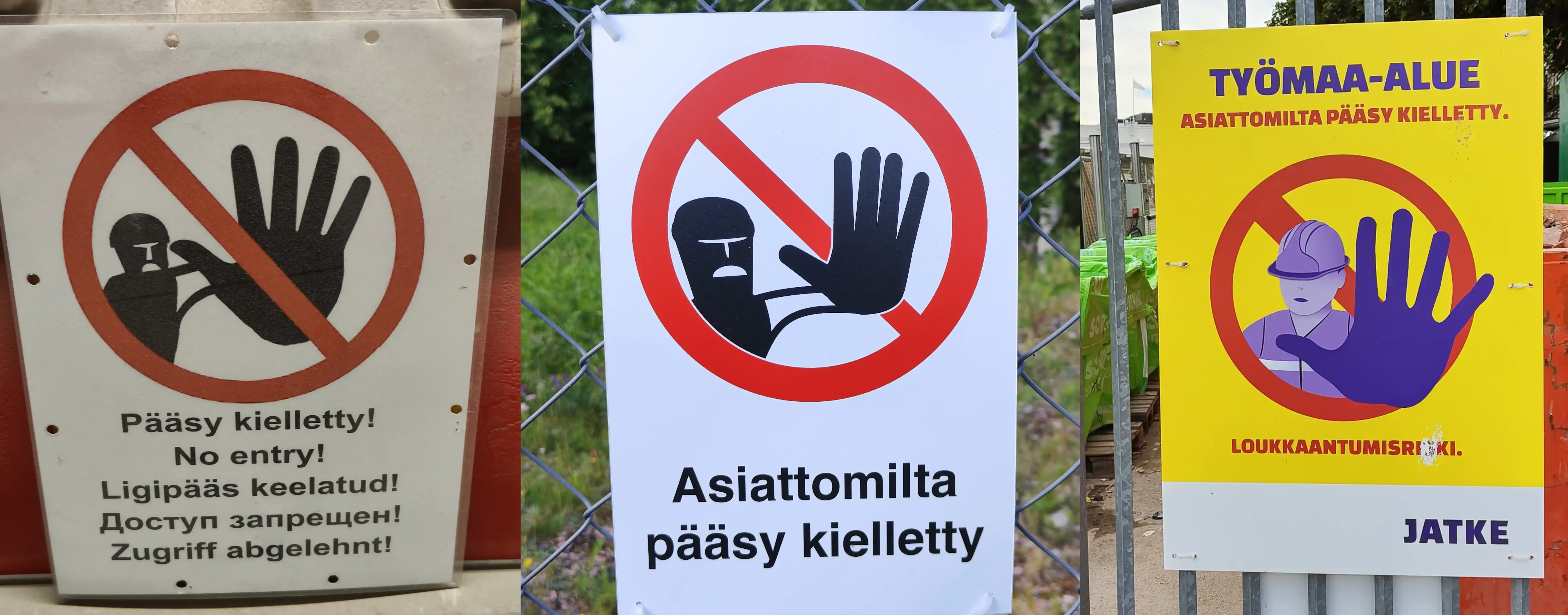
Here we have three variations on the classical sign of a person stopping the viewer by holding out a hand. All of the variants also include the standard "red circle with a slash" symbol meaning "no" or "forbidden". For now we'll focus on these two aspects and ignore the textual components, colors, styles, sign vessels and so on.
What I find fun this time is the relation of the two pictorial objects in the sign: the person icon and the circle-slash symbol. All of the signs use the superposition of these two objects as a major part of the sign, presumably to emphasize their shared message of "STOP/NO". But note how e.g. the leftmost sign has positioned the circle-slash symbol over the person icon, whereas the middle one has the person-icon sort of reaching out through the symbol. And as an of extreme example the rightmost person-icon is not even bound by the circle-slash symbol.
From the context it is obvious that the two objects are meant to work in conjunction, but in the first image wouldn't it be a natural interpretation that the circle-slash aims to forbid the thing symbolized by the person-icon? I.e. isn't this a sign that says "No forbidding allowed!"? The second, and especially the third, version are a lot more clear on this point, in my opinion, due to the circle-slash and person-icon being more intertwined. This intertwinedness, to me, enforces the idea that the two objects are collaborating instead of one being the target of another.