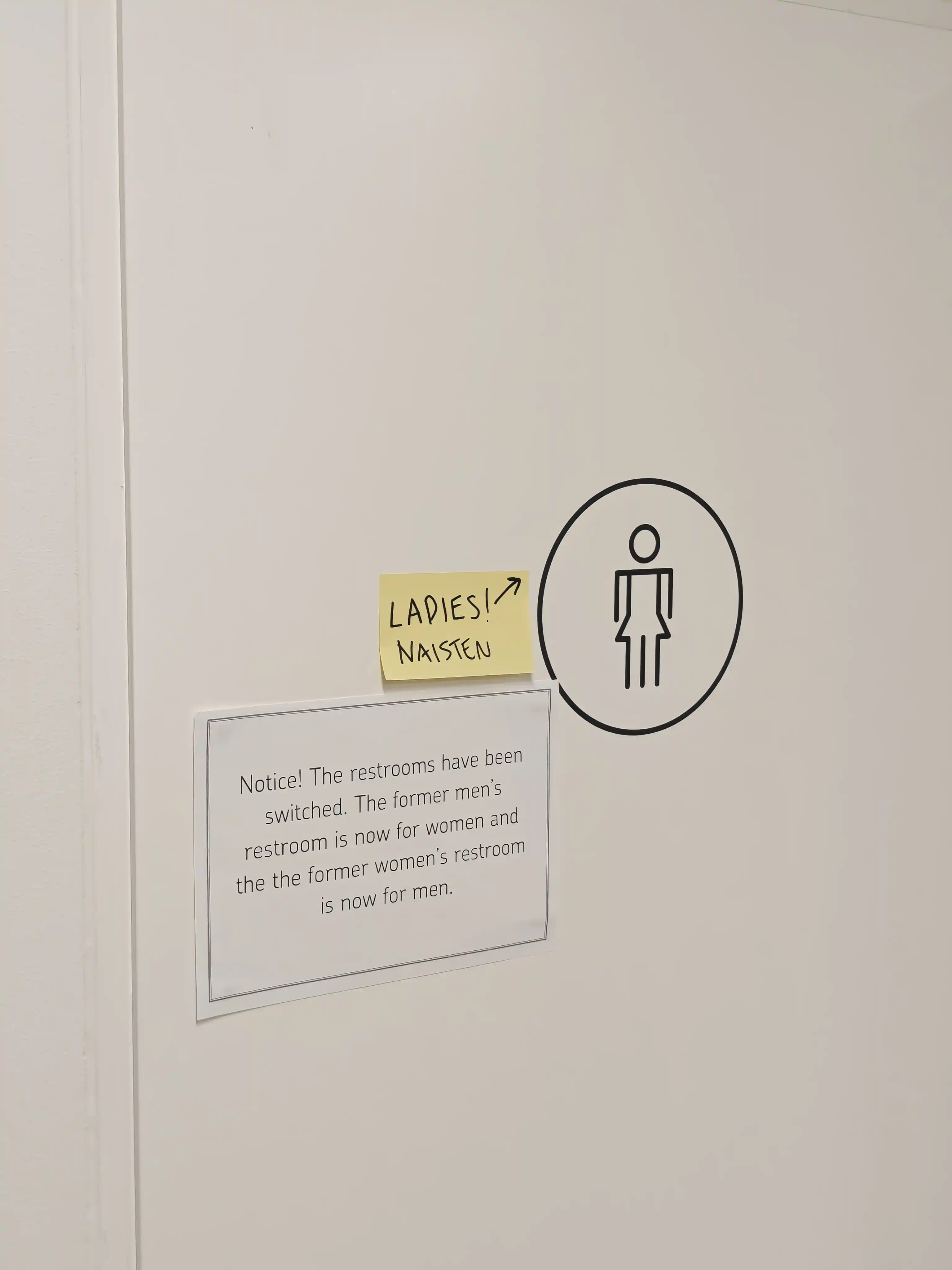
These signs were located in the door of bathrooms in a bank in Helsinki, Finland. The first "base" icon is just a stylised icon of a woman, indicating a women's bathroom. In addition to this we have a post-it note with an arrow pointing to the first sign saying "LADIES! NAISTEN [Finnish for ladies')", and a third one, a stylised printout with the bank's style guide font, explaining that the location of men's and women's bathrooms has switched.
So we have a sign, an emphasis sign, and an explanatory sign that both emphasises the original sign and explains the need of all signs involved. I found the interaction of the three very interesting. Furthermore, the sign vessels tell a story of certain urgency, with the printed style-following A4 surely haven taken longer to plan and print compared to the post-it note stuck to the door.