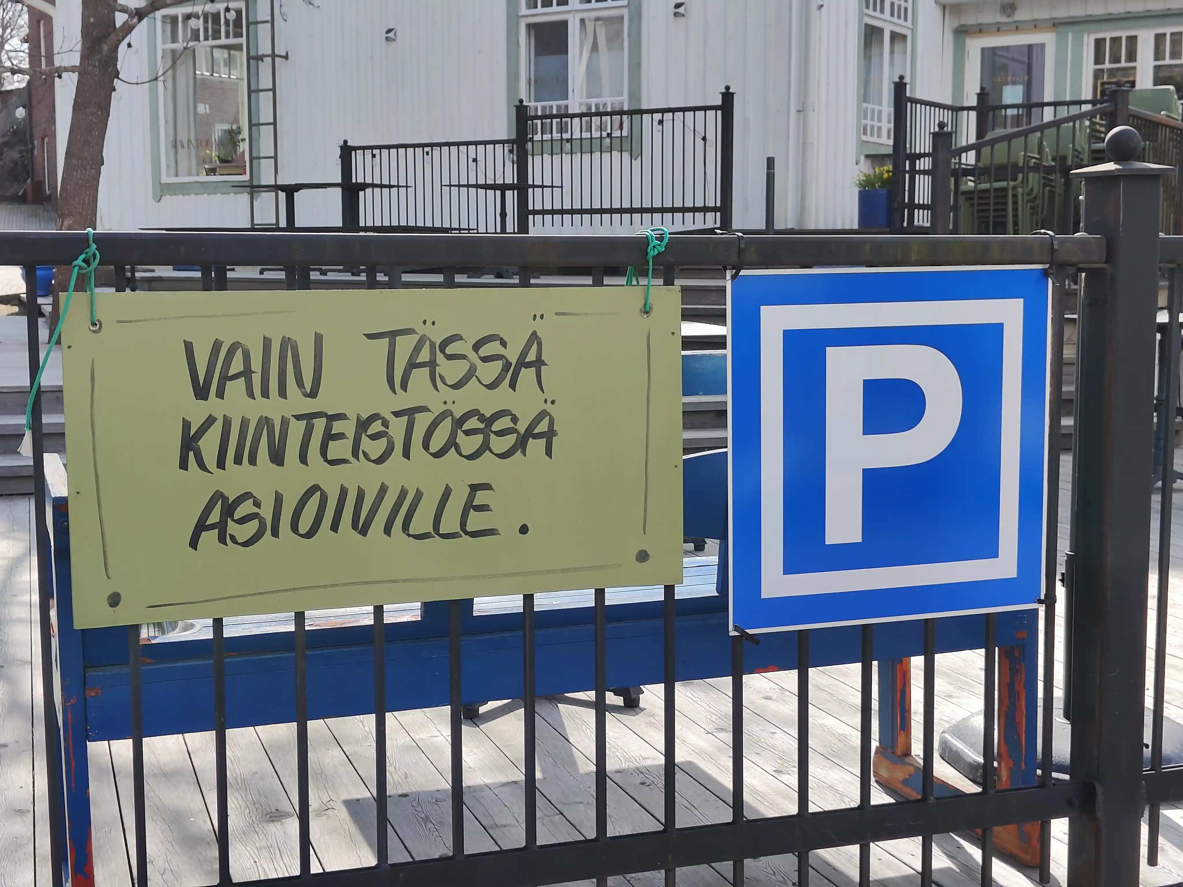
Here we have a double sign from the parking area of a restaurant in Espoo, Finland. The parking area sign on the right is your typical capital "P" as white text on a blue background, but what caught my attention was the extra signage on the left. The text is in Finnish and says "ONLY FOR PEOPLE DOING BUSINESS IN THIS BUILDING".
Such extra signs are quite common in Finland, but you usually see them in more official form:
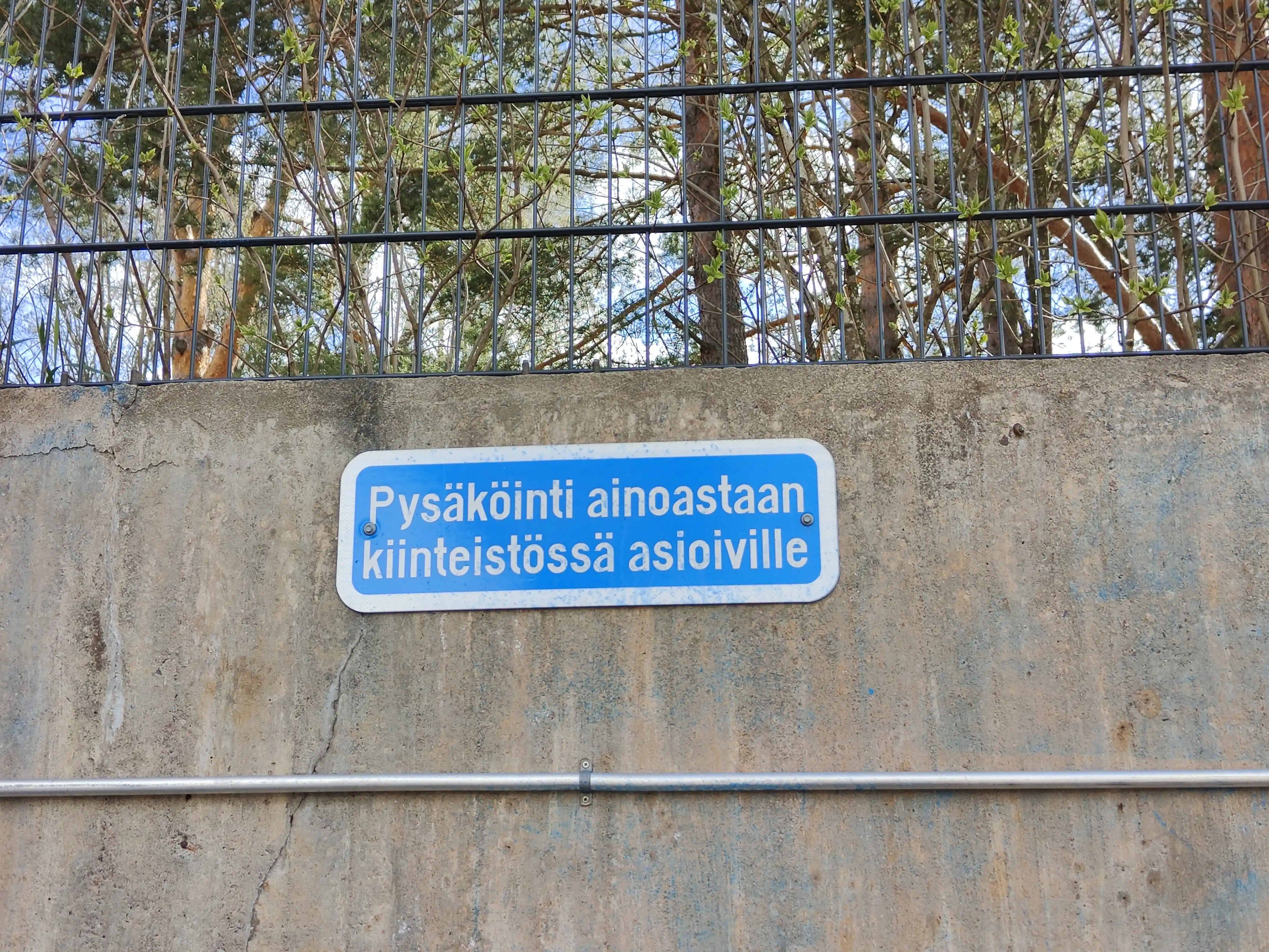
("PARKING ONLY FOR PEOPLE DOING BUSINESS IN BUILDING")
Here we note that even though the textual content is at the same level of politeness in both cases, the clearly handwritten version feels [sic] much warmer. To me the human touch softens the restricting and commanding message.